This is an old revision of the document!
Table of Contents
Data visualizations on SmartDublin
Who is this guide for
- Users visiting SmartDublin to explore data
What this guide teaches
- How to make simple graphs of CSV data on SmartDublin
Things to know beforehand
Only data stored in CSV files is suitable for visualization. The only data that can be graphed is where there is a numeric parameter with text fields (for example the weight of waste collected on each date in a month), or else text fields that it makes sense to summarise with a count (eg. number of waste collections per area).
A maximum of 1000 data points are shown on the graph for performance reasons. This will be taken from the top of the resource, so it's important to understand that the graph you're displaying will be filtered if you are looking at a large data file.
Examples of data visualizations
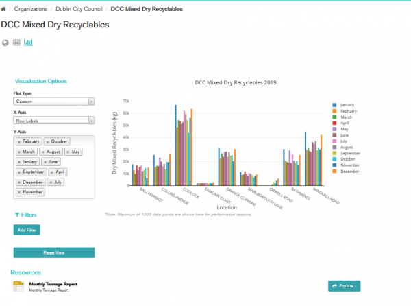
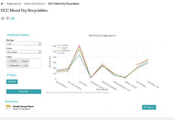
This is the default graph for Mixed Dry Recyclables which shows the total weight collected in each month for each area. You can change the plot type, for example to “Line” and select only months July-October.
The title of the graph is the name of the CSV file, the x-axis label is from the CSV file, “Row Labels”. This demonstrates the need to have meaningful labels on the data.


